Tuesday, October 26, 2010

Lino Test


My first lino print! Actually, my first relief print of any kind. I think it came out alright. I used some heavy printmaking paper since I have a bunch of scraps lying around from last semester. I think thinner paper is supposed to work better for relief printing, but this seemed to work okay (maybe the edges would have been crisper with thinner paper?)


This is a character I've been doodling lately for a series of images titled CONQUER EARTH. I'm designing some other characters and plan to make a series of prints and illustrations around this concept. More details once I've developed it a bit more. I'm hoping for a certain xmas present this winter that will give me access to a print studio so I can make some intaglio prints for the really big ideas. Until then, I'm going to practice with lino.

Friday, October 22, 2010

First Lino cut

Woah, long time no post. The lack of a printing press in my life is pretty depressing. But here's a lino block I carved tonight! My first one ever! A few years ago my mom took a relief printmaking class, and it just so happened that she had a few pieces of linoleum hidden away in the basement along with the cutting tools. The linoleum seemed a bit...hard...and some of the tools a bit dull, but all things considered I don't think it came out too bad.


The dark stuff on it is just some chalk pastel that I rubbed over the surface to see what it looked like. Unfortunately I don't have any inks so I can't print it tonight. That's another adventure for another day.

Monday, August 2, 2010

Yudu Test

Trying out the Yudu! The enclosed exposure unit is really cool. I cut out a simple stencil to test it.


[Insert missing steps here]

And here's the print.


Overall, it was easier to use than I expected, given all the negative reviews online. The emulsion sheet adhered to the screen well, although the fan took quite a while to dry the emulsified screen. I wasn't in a hurry so I just left the fan on for a few cycles, but a hair dryer would probably get the job done faster. The 8 minute timer was perfect for exposing the screen and the unexposed areas washed out easily. Since the screens are flat, they're easy to tape off and clean, which I really appreciated. I used regular Speedball ink rather than the Yudu ink and it worked fine. In the future I'll probably add some extender or just be more generous with the amount of ink I use. The print itself turned out really crisp and beautiful.

So, the Yudu is a pretty cool device. Can't wait to use it for some real prints, now that I've done this little test! Many t-shirts to come.

Tuesday, May 18, 2010

Final Cat Prints

Still missing an epic title. Another project I should add to my previously posted to-do list is coming up with a title for this piece! I also still want to write a simple story in French to go along with the print. I mean...look at him...he's begging to have his snooty story told.


Edition of 5


Edition of 2


Yay! I'm happy with it and would like to try more multi-plate color work in the future.

Also, thanks to my best buddy Sara King I've discovered the magic of deviantart's portfolio feature. My page is kind of blah right now but I'm going to work on making it into a nice little portfolio: penelopeyocum.daportfolio.com.
I definitely want to make an image to replace to generic "Welcome" thing on the main page.

Oh and...I'm graduating tomorrow! I don't actually feel terribly excited but maybe it'll suddenly hit me tomorrow when I wake up. Or when I'm listening to the commencement speaker. Or when I'm walking up to get my diploma. Hopefully it'll sink in at one of those points.

Monday, May 10, 2010

Summer Goals

The semester (and my career as an undergrad) is quickly coming to an end. I'm hoping to make lots of prints this summer though, and hopefully take some printmaking classes in the fall if I have time.

Some specific projects I want to complete this summer:
-Two-color gocco prints
-Complete stationary sets (right now I have a bunch of cards printed but no envelopes...need to remedy that!)
-Small hand drawn/printed books--possibly small linocuts.
-SCREEN PRINTING! I really want to get a legit exposure unit set-up and calibrated so I can create screens with the photo emulsion technique.

This summer I'll be working as a Residential Advisor at the Center for Creative Youth at Wesleyan University. I'm looking forward to it, and am hoping to conduct a screen printing workshop for the students. So, before that all begins at the end of June, I'm going to design an image to use in the workshop. Actually creating a screen during a workshop would be a bit too time-consuming I think, so I'm planning on creating the screen ahead of time, then explaining the process during the workshop and letting the students print on their own shirts/bandannas/what ever using the pre-made screen. I'll have my supplies there, so if a few students are really interested in creating their own screens, I can always work with them independently after the workshop.

Part of what I'm looking forward to at CCY is a potential break-through regarding my feelings toward teaching. I've only had experience teaching my peers, so teaching high school students should be an interesting (hopefully enjoyable) challenge. I know I'll be returning to school in the next year or two. But first I need to figure out what I really want to do.

Friday, May 7, 2010

Gestation, Color Separation, and Monotypes

Woooah big update. I finally scanned a few of my BIG prints. Unfortunately, even though I scanned them in sections and pieced them together in Photoshop, they are slightly cropped because there was just no way to fit all the missing edges onto the scanner.

"Gestation" measures 18"x24" and is printed on cream paper in an edition of 5, with 3 additional unique color prints outside the edition (two printed à la poupée, one with stenciled surface rolls).


à la poupée print


a print from the edition


Today I was super productive and printed my entire multi-plate color edition in one day! I didn't think it could happen, but it did. I just couldn't stop. The prints have to dry overnight but I'm going to check them out tomorrow, clean them up, and sign them. Still need to think of a clever title. But here are my final color separations.


Thalo blue plate (printed first)


Magenta poupée and Orange poupée (bright red mixed with process yellow)


And here is a little kitty...I call him "Le Petit Chat Sur Le Grand Fauteuil":


I've also been working on my Monotype project. Here are two of my favorites:


That's all for now. More soon! In the coming weeks I'll be adding many new prints to my Etsy shop.

Tuesday, May 4, 2010

Color Proofs

Last week I did a few color proofs for my multi-plate color print! For these prints, the first plate carried two colors, and the second plate carried one color. The letters at the top of the first plate were inked à la poupée.


(AHHH bad registration)


I love the vibrancy of the third one, and those are the final colors I'll be using. Today I made another proof using the same colors, this time adding more magenta to other areas of the plate by inking both the letters and the chair à la poupée. I also printed it on cream-colored paper, so I'll compare it to the other proofs tomorrow and see if I like that better. Tomorrow I'm planning to do at least one more color proof to experiment with the magenta poupée a bit more, then I'll print the edition!

Also, here's a monotype I did a few weeks ago. This was sort of my concept for the final project, but it's completely different now. I think I've determined that monotype isn't really my "thing" but I'm still pressing forward and working to make my final project as nice as possible.

Monday, May 3, 2010

le chat noir

On Friday I printed an edition of 18 of the little hypnotic cat. I decided to call him "Le Chat Noir" (The Black Cat). I think his shadow has a mind of its own. I'd like to write a short story/poem to put on the back of each print, but that will have to wait another week or two, after Finals Insanity has ended.

As you can see, I ended up rounding the corners, and I'm happy with how it turned out! I think some of the subtlety in the spitbite wore out (in the sky/horizon), or the blankets/pressure on the press weren't quite right. Regardless, I'm happy with it and it was nice to see that all 18 prints ended up being edition-worthy.


Proper scan coming soon, along with lots of exciting color proofs of my other kitty-print (still in need of a title--suggestions welcome).

Edit 5/4

Here's a scan of "Le Chat Noir"! Lucky 13 :)

Sunday, April 25, 2010

Aquatint Progress

Using hard ground to block out areas that I don't want to aquatint:


After aquatinting and removing the hard ground:


Color separation of the two plates:


(Burnt Umber, Midnight Blue)

These aren't the colors I'm going to end up using, but it's the general palette (one warm, brownish plate, one cool grey-blue plate). I'll also be inking the words at the top of the brown plate à la poupée using a bright red magenta-type color.

Friday, April 23, 2010

Gestation and Aquatint Planning

Progress on my multi-plate color print (which is...not printed in color yet).

Today I spent a few hours painting hard ground on my plates to block out areas that I don't want to bite for aquatint. I also spent some time figuring out exactly where I want the aquatint tones, which plates they should be on, and how long I should bite different areas. I haven't really done much with aquatint, so this will probably be a challenge for me. Here's to hoping that I don't completely mess it up! Below is a photo of me attempting to plan the tones using ink washes. Aquatint test strip is close at hand for the sake of figuring out how long I would need to bite to get different tones.


I also decided that I will only be making two plates. The third plate would have had so little on it, I decided to switch a few things so I could just put those details on the second plate.

And, finally an update on my big print, titled "Gestation." The below print was created before the plate was finished, so the edition is slightly different. I'll get a photo of it eventually (and the two colored prints I made à la poupée). This print was conveniently tacked up on the wall, so I took the opportunity to photograph it.


Surface roll (dark red/brown) + stenciled surface roll (pink).

Sunday, April 18, 2010

I'm a cat, I'm a kitty cat...

CAAATS! Below is the first proof of my multi-plate color print.


This print is of the first plate, which will end up holding just about all the linework and will serve as the key plate. There are two other plates: one that will primarily consist of aquatint (and spitbite), and the other with the letters that will be at the top (see previous post with sketches). Obviously the idea has changed slightly, but the general layout is the same. Today I did some more etching to add the swirly lines in the background (which are also in my previously posted sketches). I did a more complete drawing of the current layout, but haven't had a chance to scan it.

I haven't used spitbite on any of my plates before, so I decided it might be a good idea to test it out first on a small plate. I doodled up the little guy below and added spitbite to the shadow after biting the linework. There is also a little bit of spitbite in the upper sky part of the image.


Isn't he cute? And hypnotic?

Sunday, April 4, 2010

Monotypes of things wearing boots

We're starting to work on our final projects in Monotype, and I'm slowly but surely figuring out what I want to do. Originally I wanted to create a series of illustrations for Edward Lear's nonsense poem The Scroobious Pip (click to read it at nonsenselit.org). I might still try creating an illustration or two as I imagined them, but I don't think it would be possible for me to finish all 15. So, I'm thinking of doing a more abstract interpretation. When I was thinking of creating the illustrations for the poem, I decided to make all the "animals" into household objects. In Lear's original illustration for the poem, he drew the Scroobious Pip wearing boots. I thought it would be fun to add that detail to the "animals" instead.


I would like to use bio-t transfers in my final prints and create collages using xeroxes and my own drawing directly on the plate. But below are some of my monotypes from last week, just messing around with what the objects might look like.


I'm also thinking of reworking this idea for my final Etching project as well (multi-plate color prints). It would be a lot more precise, so I could get all the details I want. I imagine the etching being less playful than the monotypes. Kind of serious but completely absurd. I want to create a nonsense alphabet as well so I can incorporate made-up words into the piece (maybe with a corresponding translation as the title). I think I'll probably use the chair for my etching piece--something ominous and decadent, with Victorian boots. I like the idea of contrasting nonsense with images that refer to the rigidity of Victorian England (when writers like Lear and Carroll were working). Anyway, concept sketch + some images that I'll probably be using for reference!


(Pink chair...I'm thinking 'No' on that)


Monday, March 22, 2010

Water-Based Media Monotypes


Both drawn using Crayon d'Ache on a plexi plate!

This week we're starting our final projects. I'm thinking of doing something with nonsense poetry (or just individual nonsense words/phrases) and possibly making a little book...

Tuesday, March 16, 2010

Stencil Monotypes

A couple weeks ago we made stencils in Monotype and used them to make prints! I decided to make a coffee cup. Here's the progression of my prints (note increasingly muddy-looking colors--boo!)


By the end of class I'd decided that string was more interesting than my cut-out stencil.

Tuesday, February 23, 2010

Frustrating days in the print studio

This is what happens when you accidentally print one proof over another:


I think it actually looks kind of interesting, but that doesn't change the fact that I basically rendered two proofs totally useless. I had to reprint the 2nd state and the 1st is now lost under the stuff I printed over it. Bah!

I did take a photo of my first proof before messing it up, however.


And here is what the plate looked like this past weekend when I was adding more texture to the background--I didn't bite it for very long so I ended up going through the same process today, biting it for 30 minutes this time to create what I hope will be a dark gray, textured background.


I really want to re-do the doll's face, but Jake convinced me not to (for now). I would like to give her a more exaggerated, artificial looking face like a porcelain doll. Her hair also isn't big enough...it looks like she is missing part of her skull or something. Since I'm not very fond of the face, I'm hesitant to add more work to it if I'm going to scrape it all out anyway. I might end up editioning the plate with the current face in tact, then scrape it out and play around with it. Printing the edition won't happen for a few weeks yet...I'm nowhere near happy with how it looks in its current state. Unfortunately I bit the initial line-work for about 50 minutes, so the lines are etched in the plate pretty deep. I've already been doing some scraping and it's a pain trying to get those lines out. Live and learn!

Saturday, February 20, 2010

Color Monotypes

This week in Monotype we had a chance to play around with color. I don't think I work very well in color, but I tried not to worry about it too much. Since using more colors would have involved more clean-up, I pretty much used the same ones throughout the class.


The white parts were just left blank on the plate. Ink applied with a paintbrush. The white flecks were created by flicking mineral spirits onto the plate with a brush.


Ghost of the previous print. I like how soft it is but I think I prefer the first one.


Using a roller to make a gradient effect; mineral spirits splashed on to create little bubble-things; paintbrush and q-tips to add and remove ink.


Next week we're learning how to make monotypes with stencils! Woo!

Monday, February 15, 2010

Intaglio - sugar lift and white ground test plates

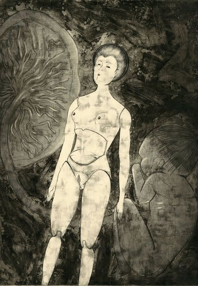
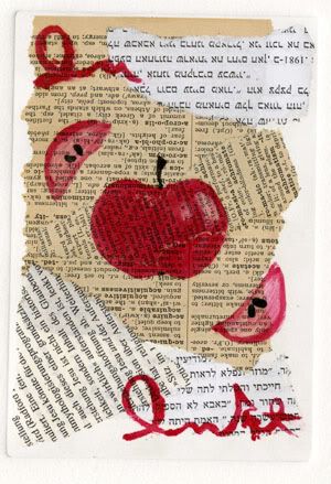
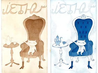
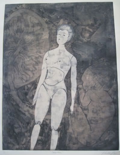
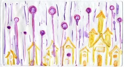
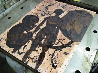
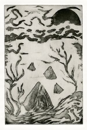
Sugar lift was the first new intaglio technique we learned this semester. Unfortunately my attempt was a failure. I'm sure I will try sugar lift again at some point, but it definitely wasn't worth the effort for this particular attempt. The sugar lift was only supposed to take 20-30 mins to dissolve, and I couldn't get it all off even after spending hours on it.

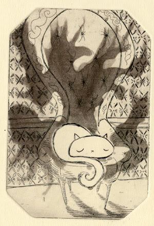
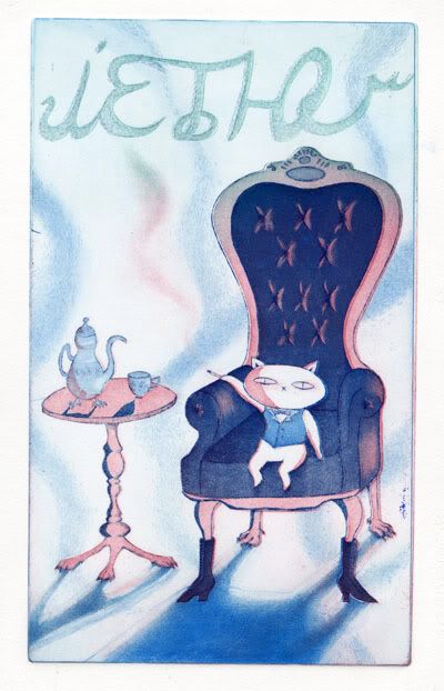
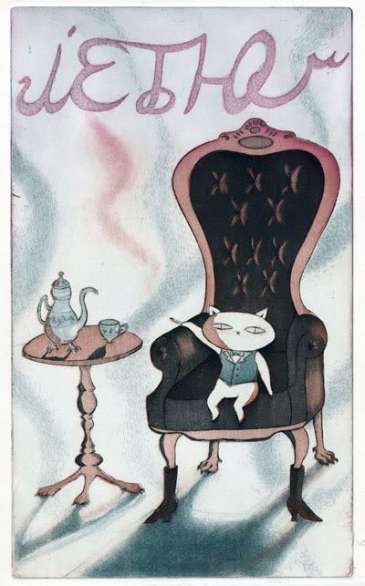
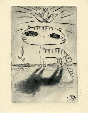
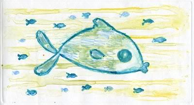
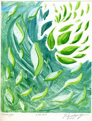
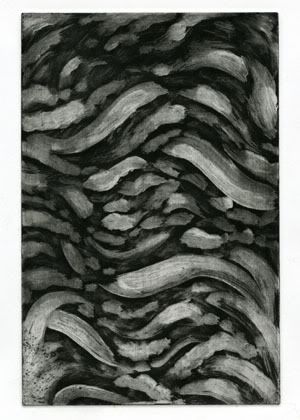
My white ground test came out much better, and I'm planning on using it for my large plate to create a background texture.

The actual process for both of these techniques is described below along with the recipes.
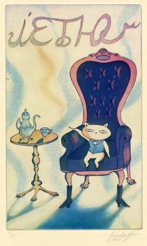
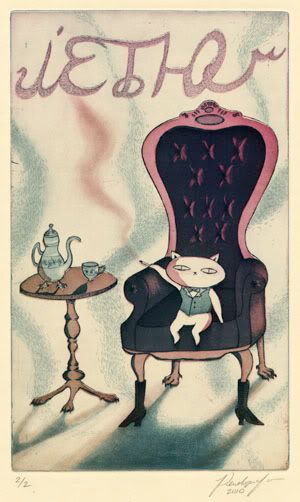
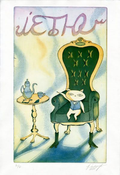
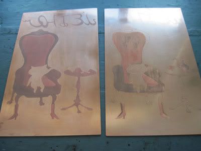
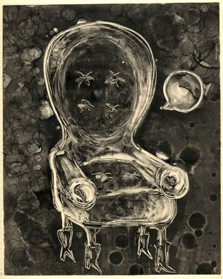
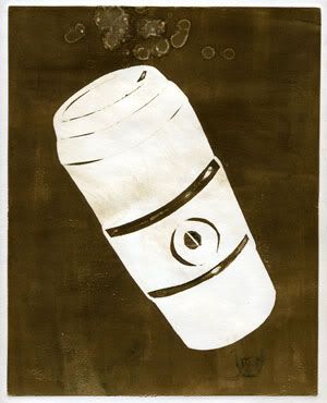
Sugar lift print


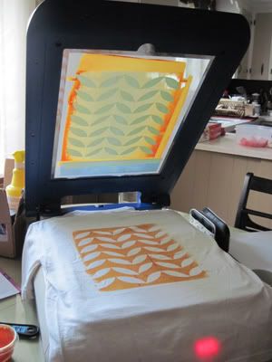
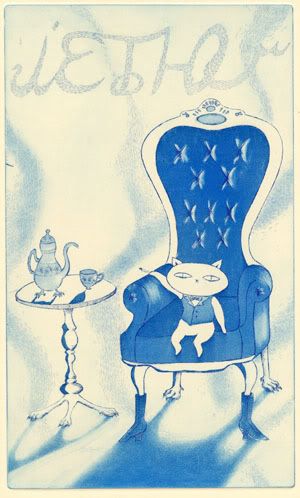
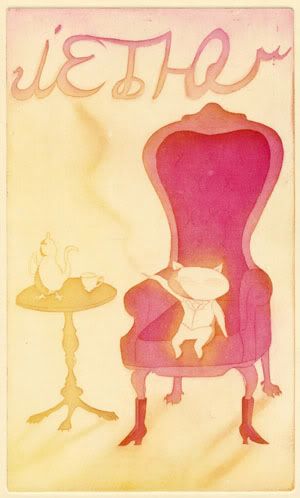
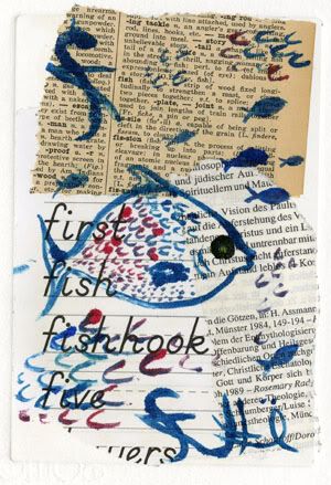
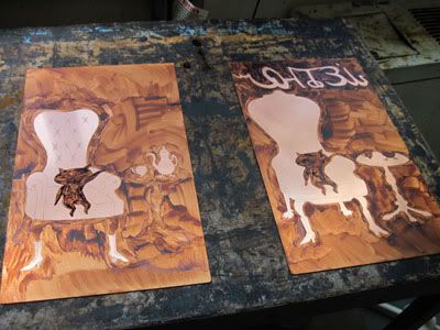
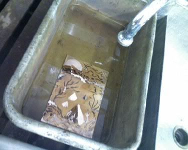
Soaking the plate to dissolve the sugar lift
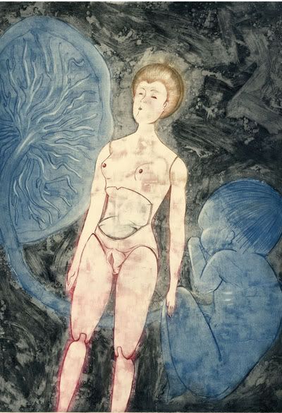
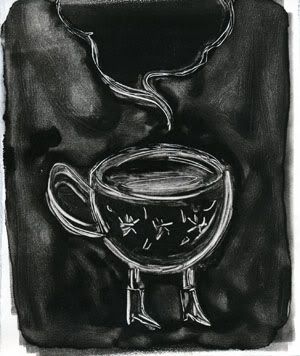
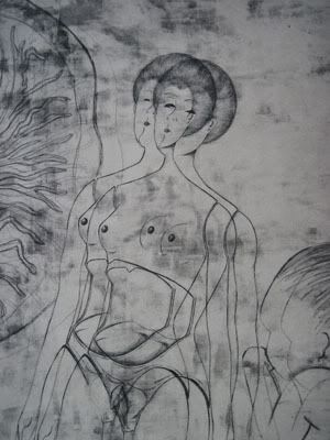
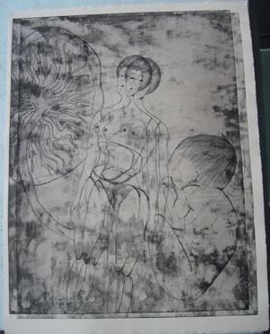
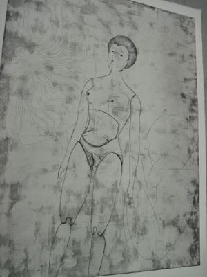


White ground print


Jake was kind enough to provide recipes for the processes we're using this semester, for future reference. Below you'll find instructions for making sugar lift and white ground.

Sugar Lift (Lift Ground) Recipe

2 cups karo syrup
1 cup india ink mixed with black poster paint, and pink hand soap or a little detergent

Clean the glass and plastic containers well (i.e. remove sticky stuff from around the rim of the glass jar and the plastic squeeze bottles that you will be storing the mixture in). Mix all ingredients well. Test out the mixture on a piece of copper. If it beads up, add more detergent and/or a little bit of water.

Thinning the hard ground that goes over the lift ground:
1 part hard ground
1 part naptha

How to do it:
1. Degrease the plate.
2. Aquatint the plate.
3. Paint the sugar lift on with a brush or apply with a squeeze bottle. Let it dry.
4. Apply hard ground (thinned with naptha) with a clean, wide brush. Let it dry.
5. Soak the plate in warm water in a tray for 20 minutes. Be patient. Allow the sugar lift to break through the ground. Do not scrub. If it doesn't lift, allow a stream of hot water from the spigot to go through the water bath onto the plate.
6. When drawing has lifted, bite to black (10-15 mins), or you may do stepped biting.
7. Clean sticky brushes, squeeze bottle and jar with water. Clean ground off plate after biting and before printing.

White Ground (Soap Ground) Recipe

This is a partial resist technique for ghostly, washy tones.

1 cup titanium white pigment
2 cups Ivory Snow (a type of detergent)
1/2 cup raw linseed oil
1 cup water

Put the titanium pigment on to a glass table top, then add the detergent. Mix them together with an ink knife. Form it into a mound with a little crater in the middle. Slowly drizzle linseed oil slowly into the mixture and mix it thoroughly so you can't see any more oil. Add the rest of the oil a little at a time. Do the same with the water--add a small amount at a time and mix very thoroughly. Put it in a glass jar with a tight lid. Stir before using. Add water if it's too thick.

How to do it:
1. Degrease the plate.
2. Put a spoonful of white ground on a sheet of wax paper. Have some water and a chinese brush handy. Mix white ground so it is a creamy consistency and paint it freely on your plate. Thinner white ground will produce darker greys, thicker amounts with produce lighter grays. You may brush, drip, or splatter the ground.
3. You can build layers of white ground, but you must dry each layer before proceeding by putting it on a warm hotplate. You may remove the ground with a rag or thin it with a spray water bottle at any point.
4. If you want a black line, take the edge of a piece of cardboard or the end of a paintbrush a draw through the ground.
5. Aquatint the plate.
6. Let the plate sit overnight. Otherwise, some of the ground with float off when you bite it.
7. Bite the plate to black (10-15 mins).
8. Clean brushes. Clean ground off plate after biting and before printing.