Sunday, April 25, 2010

Aquatint Progress

Using hard ground to block out areas that I don't want to aquatint:


After aquatinting and removing the hard ground:


Color separation of the two plates:


(Burnt Umber, Midnight Blue)

These aren't the colors I'm going to end up using, but it's the general palette (one warm, brownish plate, one cool grey-blue plate). I'll also be inking the words at the top of the brown plate à la poupée using a bright red magenta-type color.

Friday, April 23, 2010

Gestation and Aquatint Planning

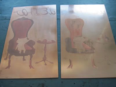
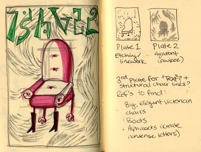
Progress on my multi-plate color print (which is...not printed in color yet).

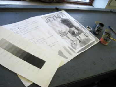
Today I spent a few hours painting hard ground on my plates to block out areas that I don't want to bite for aquatint. I also spent some time figuring out exactly where I want the aquatint tones, which plates they should be on, and how long I should bite different areas. I haven't really done much with aquatint, so this will probably be a challenge for me. Here's to hoping that I don't completely mess it up! Below is a photo of me attempting to plan the tones using ink washes. Aquatint test strip is close at hand for the sake of figuring out how long I would need to bite to get different tones.


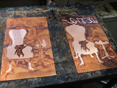
I also decided that I will only be making two plates. The third plate would have had so little on it, I decided to switch a few things so I could just put those details on the second plate.

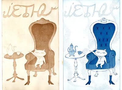
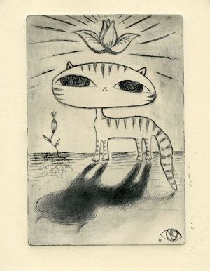
And, finally an update on my big print, titled "Gestation." The below print was created before the plate was finished, so the edition is slightly different. I'll get a photo of it eventually (and the two colored prints I made à la poupée). This print was conveniently tacked up on the wall, so I took the opportunity to photograph it.


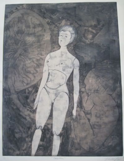
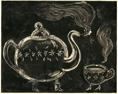
Surface roll (dark red/brown) + stenciled surface roll (pink).

Sunday, April 18, 2010

I'm a cat, I'm a kitty cat...

CAAATS! Below is the first proof of my multi-plate color print.


This print is of the first plate, which will end up holding just about all the linework and will serve as the key plate. There are two other plates: one that will primarily consist of aquatint (and spitbite), and the other with the letters that will be at the top (see previous post with sketches). Obviously the idea has changed slightly, but the general layout is the same. Today I did some more etching to add the swirly lines in the background (which are also in my previously posted sketches). I did a more complete drawing of the current layout, but haven't had a chance to scan it.

I haven't used spitbite on any of my plates before, so I decided it might be a good idea to test it out first on a small plate. I doodled up the little guy below and added spitbite to the shadow after biting the linework. There is also a little bit of spitbite in the upper sky part of the image.


Isn't he cute? And hypnotic?

Sunday, April 4, 2010

Monotypes of things wearing boots

We're starting to work on our final projects in Monotype, and I'm slowly but surely figuring out what I want to do. Originally I wanted to create a series of illustrations for Edward Lear's nonsense poem The Scroobious Pip (click to read it at nonsenselit.org). I might still try creating an illustration or two as I imagined them, but I don't think it would be possible for me to finish all 15. So, I'm thinking of doing a more abstract interpretation. When I was thinking of creating the illustrations for the poem, I decided to make all the "animals" into household objects. In Lear's original illustration for the poem, he drew the Scroobious Pip wearing boots. I thought it would be fun to add that detail to the "animals" instead.


I would like to use bio-t transfers in my final prints and create collages using xeroxes and my own drawing directly on the plate. But below are some of my monotypes from last week, just messing around with what the objects might look like.


I'm also thinking of reworking this idea for my final Etching project as well (multi-plate color prints). It would be a lot more precise, so I could get all the details I want. I imagine the etching being less playful than the monotypes. Kind of serious but completely absurd. I want to create a nonsense alphabet as well so I can incorporate made-up words into the piece (maybe with a corresponding translation as the title). I think I'll probably use the chair for my etching piece--something ominous and decadent, with Victorian boots. I like the idea of contrasting nonsense with images that refer to the rigidity of Victorian England (when writers like Lear and Carroll were working). Anyway, concept sketch + some images that I'll probably be using for reference!


(Pink chair...I'm thinking 'No' on that)